
How to Create Charts
Learn how to add and configure charts to flexibly display your data using basic chart types like line or column charts.
Basics and Creating Charts
Charts are the key mechanism in Valsight to display and interact with your data. They are always part of a simulation workspace, so the data they display is based on a model and your scenarios that are configured in the workspace. You can arrange your charts in multiple tabs and layout multiple charts per tab in a dashboard-like interface.
Some basics you should know when working with charts:
Charts are always calculated dynamically based on the underlying value driver logic and configured simulation scenarios. So changing a scenario, your model, or your data will always lead to a recalculation of charts so that the latest data is displayed.
You describe the data a chart should display by setting its axes and optional filters. The axes depend on the chart type and define the two dimensions that are used to visualize the data, e.g. which information should be on the x-axis and by which property the data series are grouped. Filters can be used to restrict the view further and only display a subset of data.
The dimensions scenarios, years, and nodes are special as they should never be aggregated in a chart. Therefore they have to be either displayed on an axis or configured as a filter.
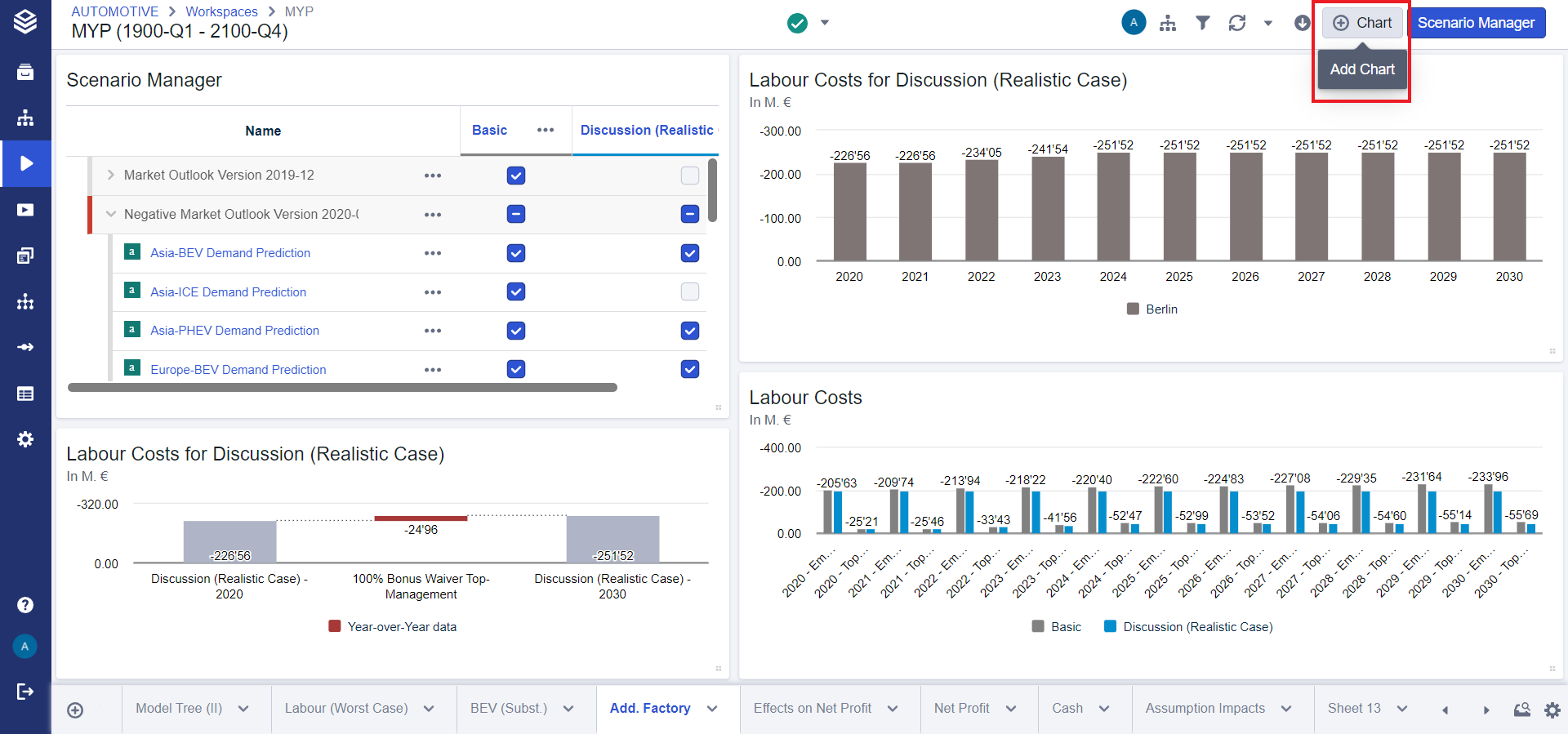
To create a new chart, either create a new tab by clicking the plus button on the very left in the tab-bar or add a new chart to an existing tab by clicking the "Chart" button in the header. You will then be guided through the creation process by the chart wizard to select a chart type a scenario and a node fot it.
Chart Configuration
See also: Configuring and Pivoting Data Displayed in Charts and Tables
You can configure your charts and adjust the settings using the inspector (in the panel on the right side of the screen). If the inspector is already open, just select your chart to display its properties. Just select the chart and click the pencil icon.
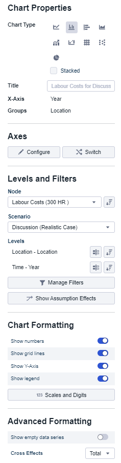
You can select the chart type by selecting the data display property. From left to right, the chart types are: (1) line chart, (2) column chart, (3) bar chart, (4) area chart, (5) mixed chart, (6) waterfall chart, (7) table, (8) bubble chart, (9) pia chart. Choose the chart type depending on the data you want to visualize.
If you do not enter an explicit title, the system automatically proposes a title for you depending on the displayed nodes, years, and scenarios. You can always manually override the title and enter a custom name.
The axis settings define the dimensions you will see in your chart, e.g. which dimension you will see on the x-axis and which dimension defines the data series marked with different colors in a line chart. You are free to select any dimension in the system to be displayed in your chart. However, depending on the data in your models, some combinations might not be available and will display no data.
Levels and filters can be used to restrict the view in your chart so that they only display a subset of data. Filters can either be multi-select or single-select filters. Each dimension that is selected as one of the axes will automatically add a multi-select filter to your chart that contains all values by default. To limit the number of values on your axis, you can restrict the filter. You can always add a new filter by pressing the "Add Filter" button and selecting the dimension and level for the new filter.
Compression allows you to compare any single data point with another data point
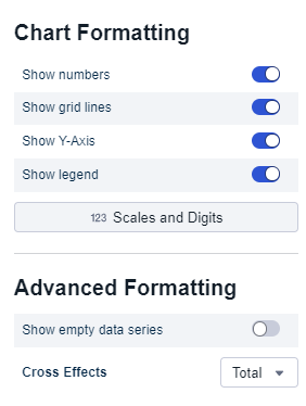
Data Format
You can further adjust the formatting of your chart to present your data the way you want. You can display numbers inside the chart, override axis settings and configure if a legend should be displayed and if null values should be hidden.
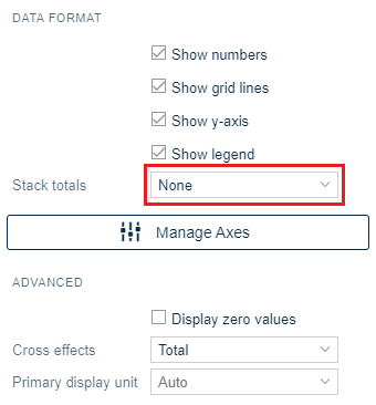
Stack totals
There are three options to choose from in the drop-down menu.
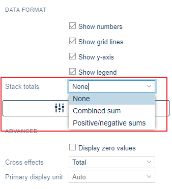
None
The default setting when inserting a new chart is 'None'.
No values are shown except the proportional values of the groups within a bar.

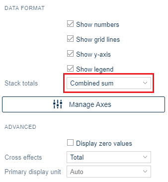
Combined sum
The second option to show the stack totals is as a 'Combined sum'.
Here, the total value of the entire bar is shown on top of the bar.
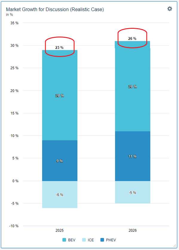
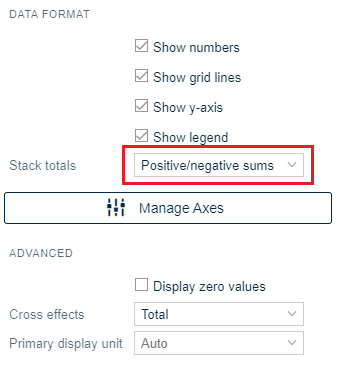
Positive/negative sums
The third option to show the stack totals is as 'Positive/negative sums'.
In this case, the sum of the negative values is shown at the bottom end of the bar, whereas the sum of the positive values is shown at the top end of the bar.

Scales and Digits
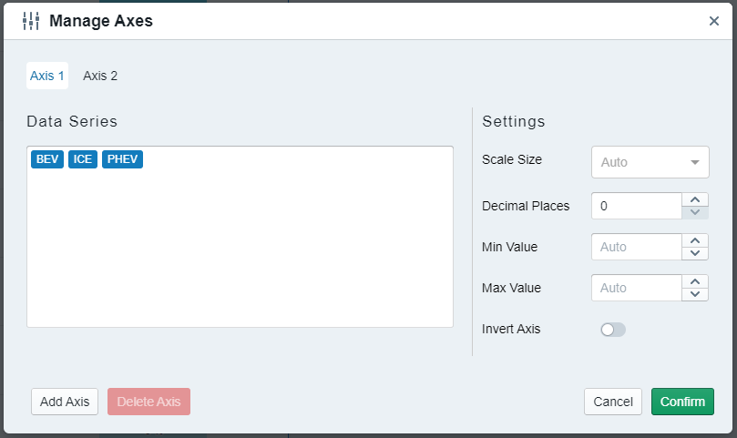
The axis configuration is individual for each axis in a chart and the settings can be changed when you click on 'Manage Axes'.
You can have multiple axes if you display multiple nodes with different units, as in the example above a node for euros and percent.
The default scale size and the number of decimal places depend on the unit and your system configuration, but you can always override the setting in your chart. In the example above, 3.480.000 Euros would be displayed as 3,5 million Euros in the chart.
The minimum and maximum values define the start and end of your axis for the respective unit. The auto value will calculate reasonable values automatically for you to use the available space as best as possible. However, it is always possible to override the values and manually adjust your axis.
Learn about using Chart Templates