
Chart Types and Data Visualization
To present your data you can choose from a set of different chart types. This article will give you an overview of the available chart types. To learn more about how to configure a chart, please read the article about how to display data using charts.
Chart | Description | Function | |
|---|---|---|---|
Line Chart | Displays its data series as connected lines. | Line charts are useful to see the development or trends of chosen key figures. | 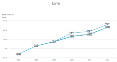 |
Column Chart | Displays data using vertical bars. Multiple data series can be displayed next to each other. | Column charts can be used to compare different key figures in the same dimensionality. For example, you can use it to compare the profit across different scenarios and years. | 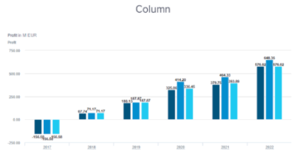 |
Bar Chart | Displays data as a rotated Column Chart. | Bar charts enable the same usage as a column chart. |  |
Stacked Column/Bar Chart | Displays its data by stacking the elements on top/next to each other if multiple data series are displayed. | Stacked charts are mostly used when multiple data series for the same value are displayed. | 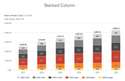 |
Displays one KPI in a single number including the unit and potentially a reference value. | This chart enables highlighting key performance indicators at first glance. | 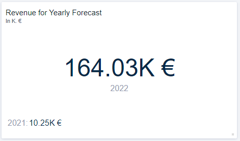 | |
Slider | Shows one or more sliders on a separate tile on your worksheet. | This tile enables you to select separate line-items and add their respective sliders to your worksheet. This enables a more flexible adjustment of data without having to enter the Scenario Manager. | 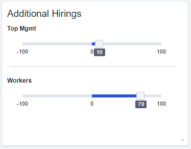 |
Perspective Selector | Inherits one or more filter combinations that can be selected to refine the view on a worksheet. | The perspective selector enables you to create one or more filter combinations (perspectives) that can be selected to quickly adjust the view onto your worksheet. These perspectives can also feature a picture for a better visualization/recognition. For example, each perspective could be a focus onto a different country. You could quickly switch between focusing on a single country or two or more countries combined. |  |
Pie Chart | Displays the data via proportional slices in a circular graph. | Pie charts are often used to effectively show the proportions of data. | 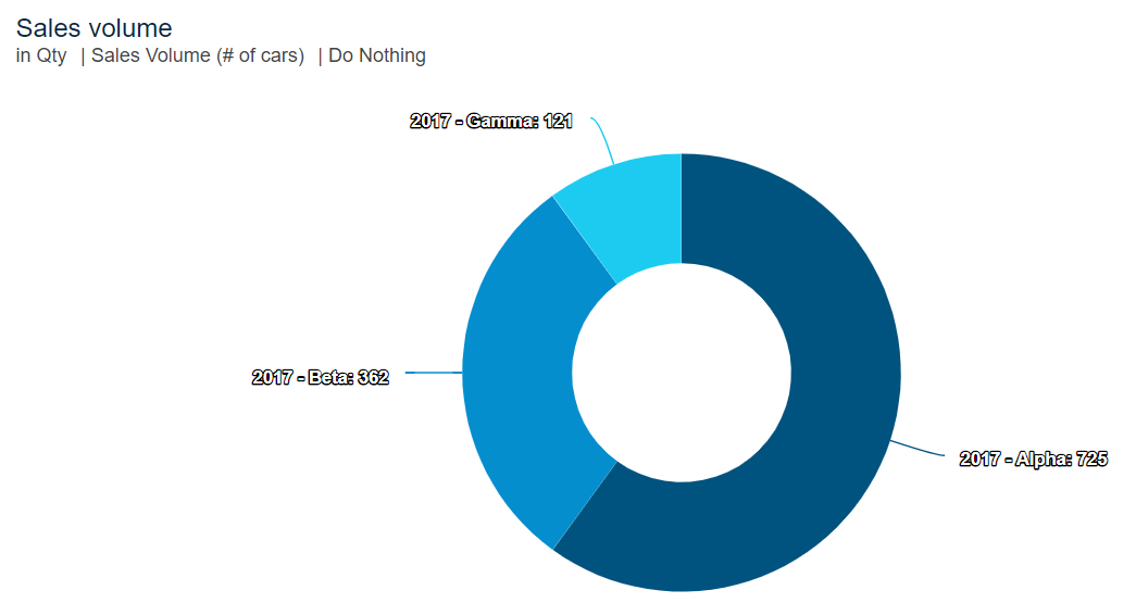 |
Area Chart | Displays data as an extension of the Line chart with the area below a line being filled with colour. | Area charts can be used to visualize data and its trends over time. | 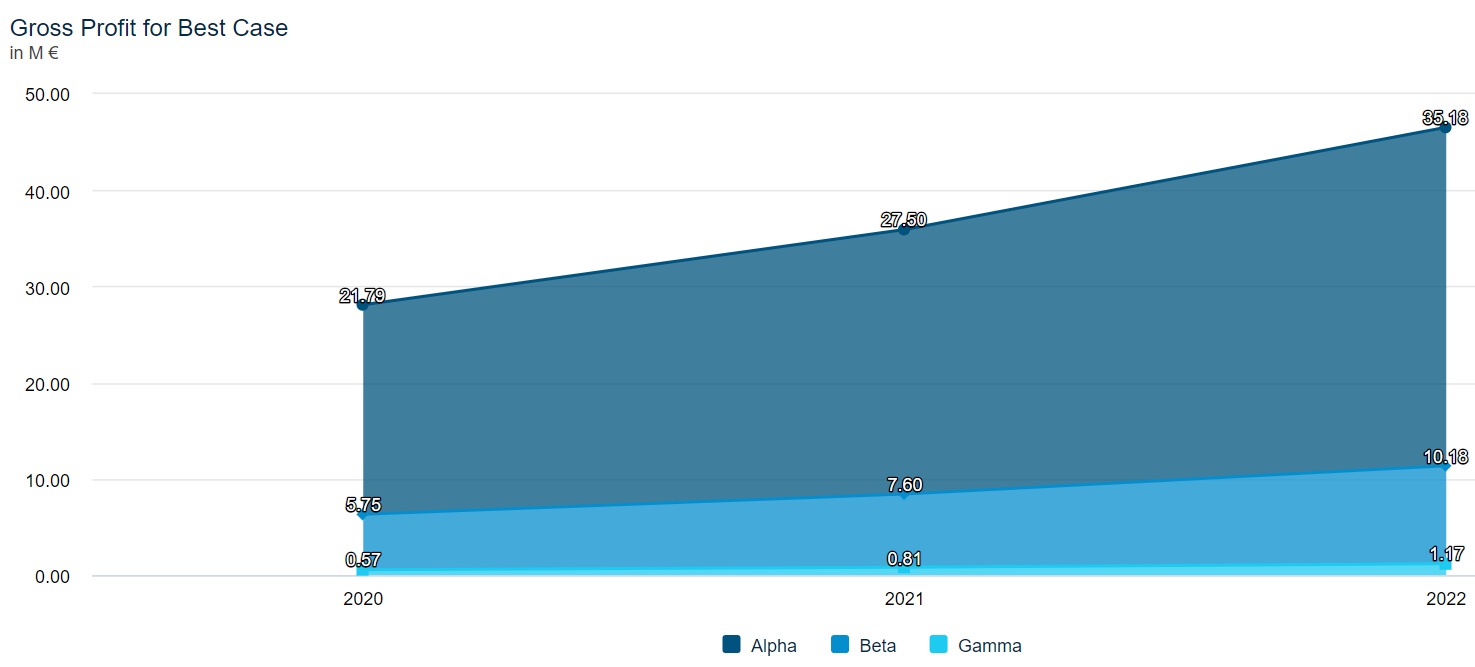 |
Mixed Chart | This chart is a combination between a stacked Column chart and a Line chart. By default, data series are displayed as stacked vertical bars, but it is possible to configure single data series to be displayed as a line. | Mixed charts can be used to display the relations between multiple key figures. | 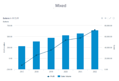 |
Table | Displays data in a tabular format and flexibly selecting dimensions for the rows and columns. In tables, you can display a lot of information from different key figures and their sub - figures across multiple Dimensions and compare different Scenarios. | With tables, you can, for example, build profit and loss statements, cash-flow statements and more. In Valsight you have the ability to do so in an aggregated or detailed format. | 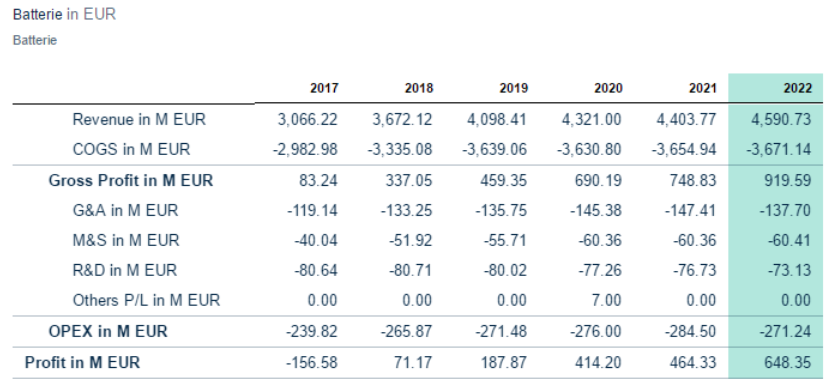 |
Waterfall Chart | Displays a transition between values. | Waterfall charts can be used to create a profit bridge that explains how the profit developed was from one year to the next or to create an assumption bridge that explains a simulation scenario by adding up the effects of all assumptions. | 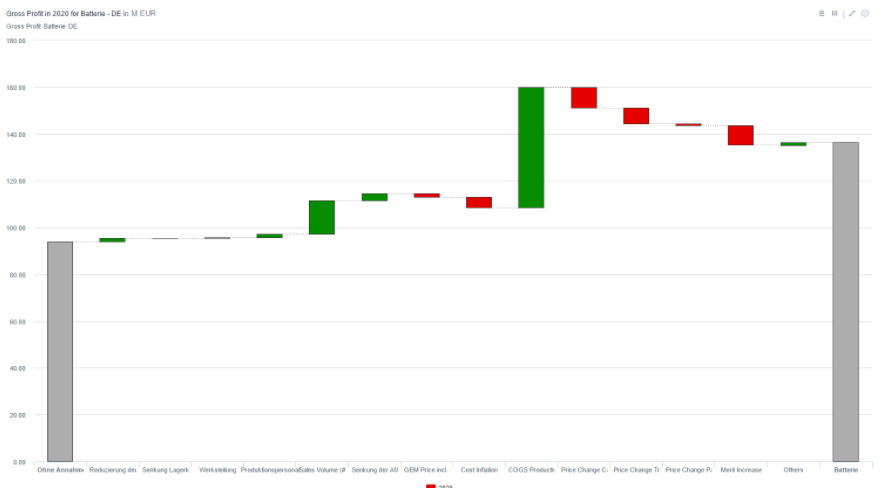 |
Packed bubble Chart | Displays data using the size (and colour) of bubbles. The positioning of the bubbles is not significant but is optimized for compactness. | Packed bubble charts are used to, for example, display the effects of several assumptions. | 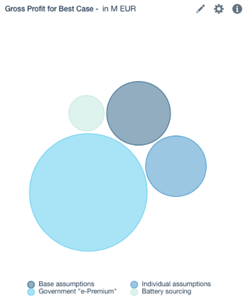 |
Scenario Bridge | Displays the effect of all Assumptions on a key figure. | With scenario bridges, you can show the effect of the whole assumptions or the effect of each line-Item inside the assumptions. | 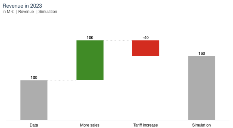 |
YoY Bridge | YoY stands for Year over Year and is a type of financial analysis that’s useful when comparing time series data. | With this chart, users are able to compare data of one time period with data from the same time period in another year. Additionally, the effects of assumptions and line-items over this time span are shown. | 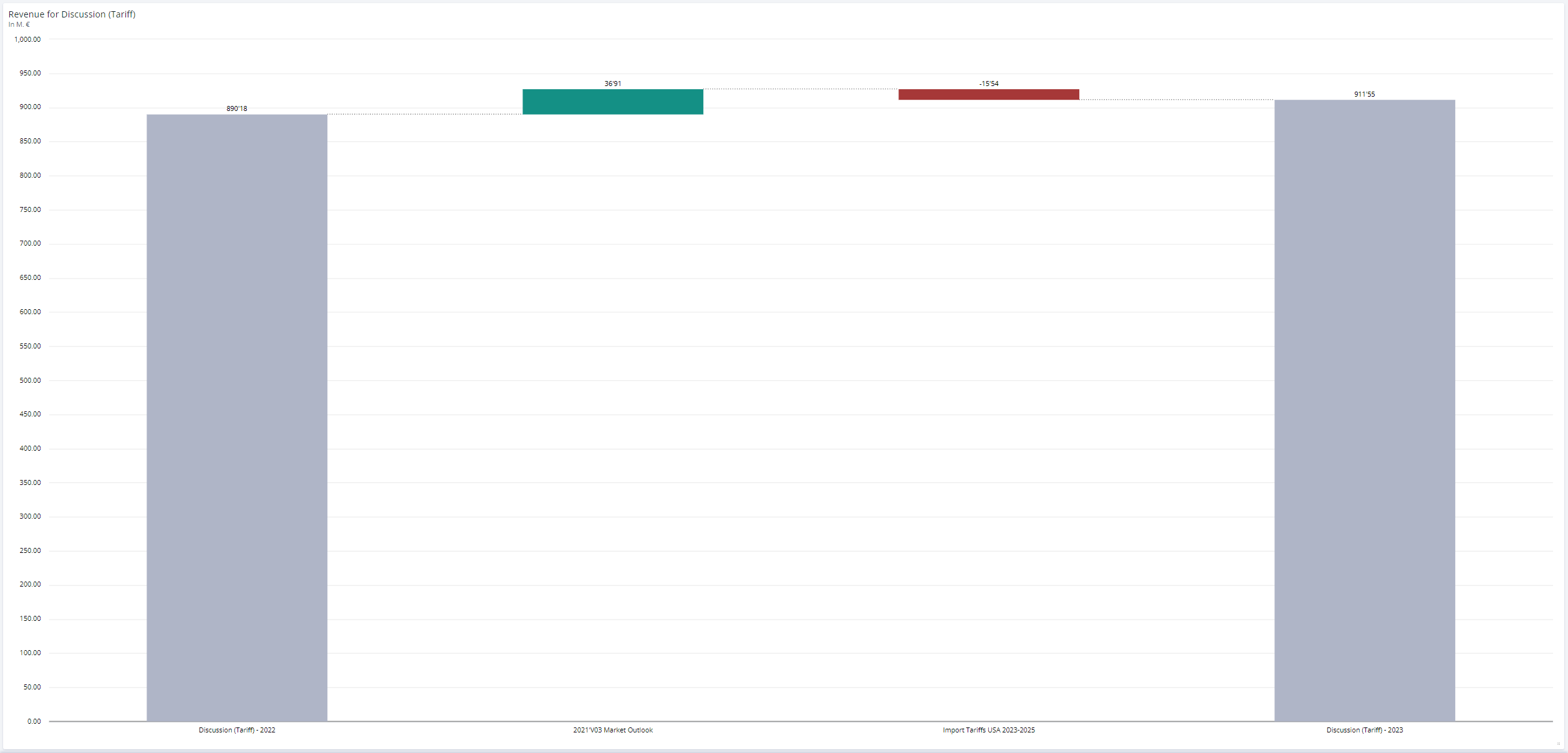 |
Model Tree | Shows the graphical Value Driver structure of the underlying Model and allows the display of values for multiple Scenarios inside of the Nodes. | Model trees are useful to understand how data flows through a model and impacts top KPIs. | 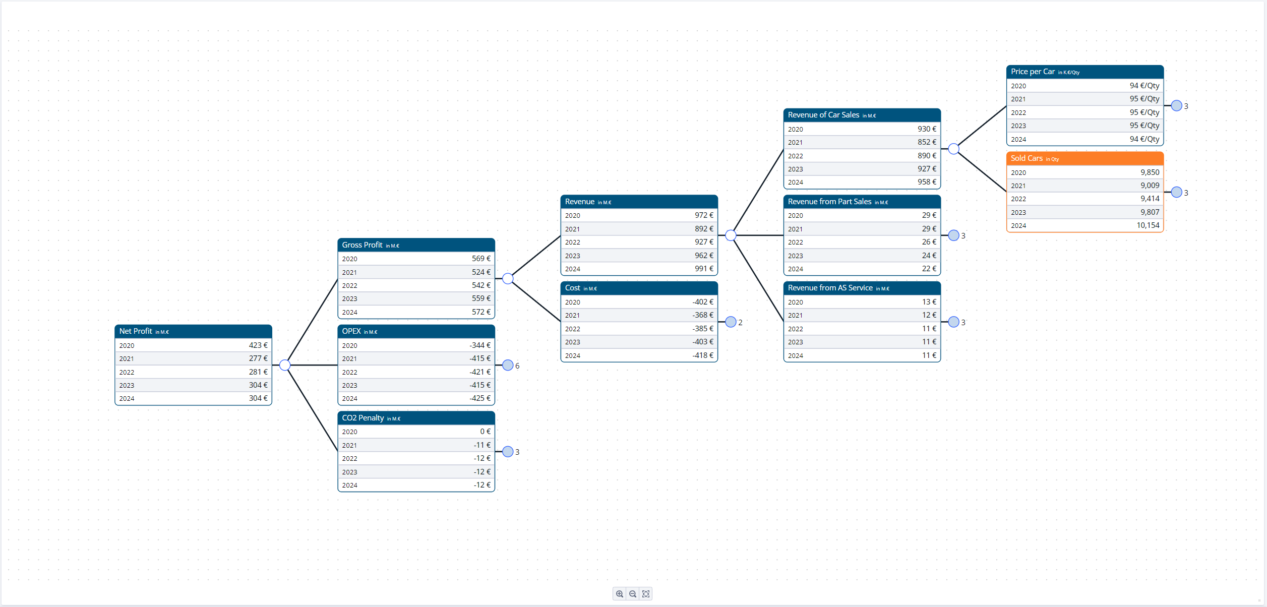 |
Scenario Manager | Shows the Scenario Manager as a tile on your worksheet. This Scenario Manager is configured per sheet and looks the same for all users ((un-)collapsed assumptions, columns, search entries). This is contrary to the stationary Scenario Manager where most settings are user specific. | This Scenario Manager shows you all assumptions and line-items as they are in the original Scenario Manager. By inserting the Scenario Manager as a tile on to a worksheet, simulations can be run faster, more spontaneous and sheet-specific. | 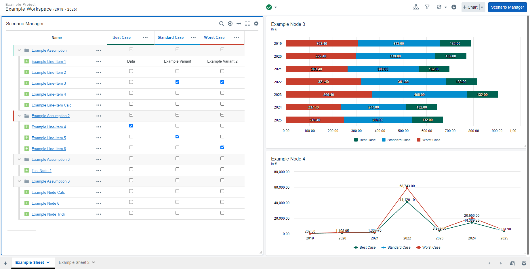 |
Image | Users can add custom images to their worksheets. | Inserting images can enhance the visual appearance of a worksheet while also allowing customizing the look of each worksheet individually. | 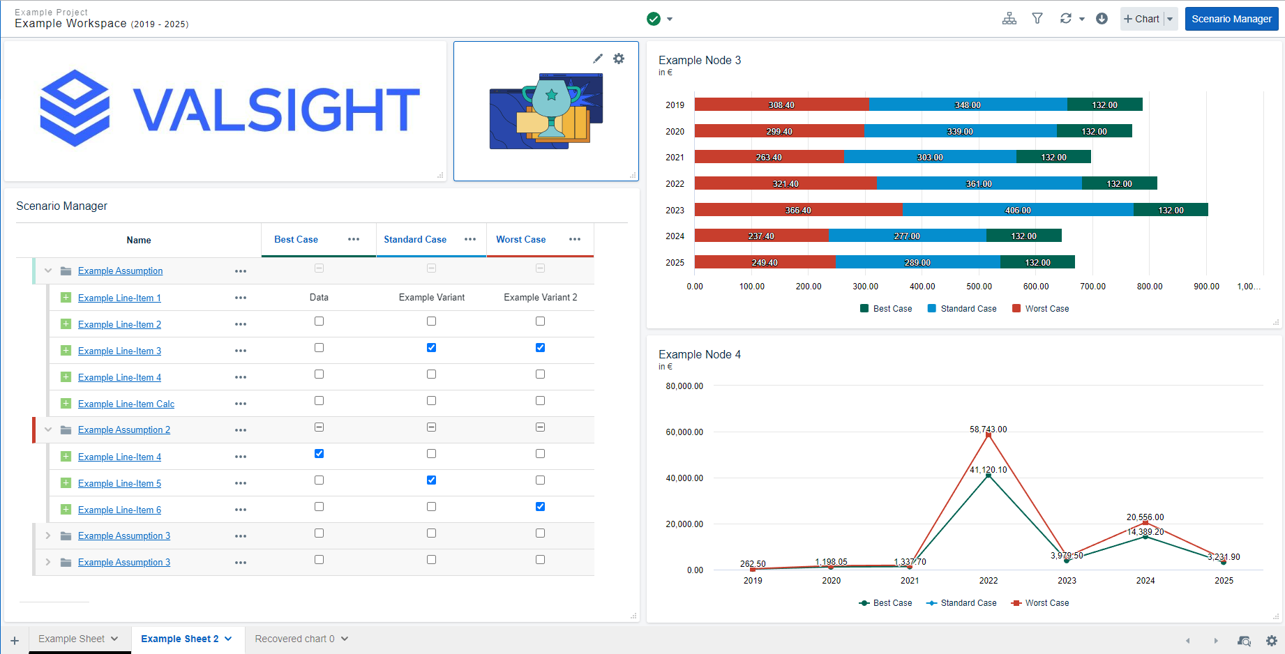 |
Text | Users can add custom texts to their worksheets. | Inserting texts on your worksheet enables a user to add further descriptions to charts or insert notes for other users. | 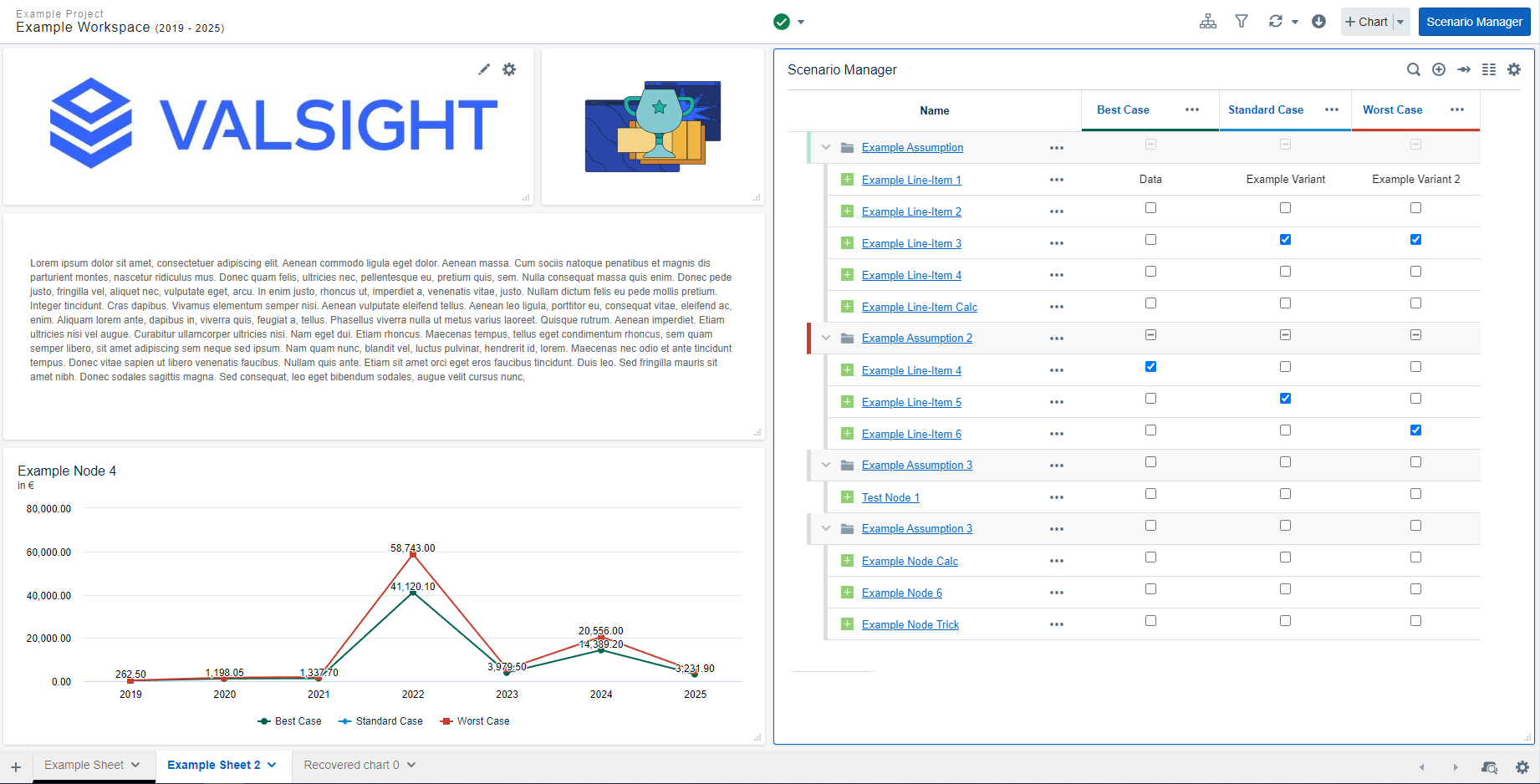 |